You’ve spent hours obsessing over hex codes and sidebar widths. You downloaded that “Modern Professional” template from Canva, thinking it makes you look like a creative visionary. But when you hit submit, you aren’t sending a portfolio—you’re sending a ghost.
The ‘Blank Page’ Resume Trap is the silent killer of modern careers. While you see a beautiful, multi-column masterpiece, the Applicant Tracking System (ATS) sees a jumbled mess of Wingdings and gibberish. If the bot can’t parse it, the recruiter never sees it. You’re being rejected before a human even knows you exist.
The Multi-Column Lie
Most people think a resume needs to look like a magazine spread. It doesn’t. In fact, the more “design” you add, the more risk you take.
ATS software is designed to read text in a linear fashion—left to right, top to bottom. When you introduce columns, the bot often reads straight across the divider. Your “Experience” section gets mashed into your “Skills” sidebar. The result? A digital word salad that triggers an automatic rejection.
- Stop using text boxes. They are invisible to many older parsers.
- Kill the icons. A tiny telephone icon doesn’t help a bot find your phone number; it just adds noise.
- Ditch the graphics. Progress bars for skills (e.g., “80% proficient in Python”) are meaningless to humans and unreadable to machines.
The “Select All” Reality Check
I remember sitting in a cramped recruitment office in downtown Chicago with a headhunter named Marcus. He was frustrated. He showed me a profile for a $180k Project Manager role that had come through his system as three pages of empty white space.
Marcus manually opened the original PDF. It was stunning—gold accents, a professional headshot, and a complex three-column layout. But because the candidate used a non-standard font encoding, the ATS couldn’t extract a single word. Marcus sighed, closed the file, and moved to the next candidate. That person lost a life-changing salary because they wanted their resume to look “pretty.”
To avoid this, use the Notepad Test. Open your PDF, press Ctrl+A (Select All), copy the text, and paste it into a plain text editor like Notepad. If the words are scrambled, missing, or out of order, your resume is broken. Fix it.
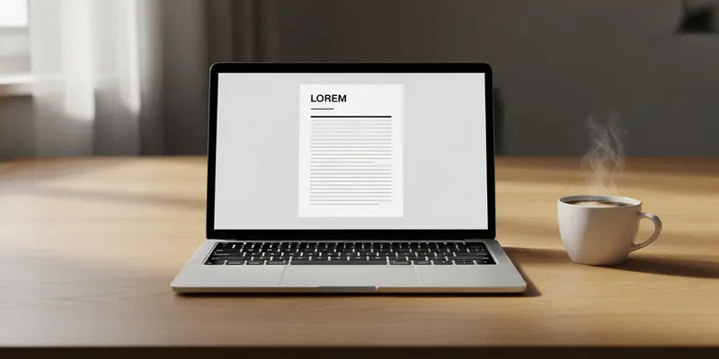
Simple is the New Sophisticated
Hope is not lost. You don’t need to be a graphic designer to get hired; you need to be a clear communicator. The most successful resumes I’ve seen in a decade of career coaching are boring. They use standard fonts like Arial or Calibri. They use clear headings. They use bullet points.
Your value shouldn’t be hidden behind a template. If your experience is solid, a clean, single-column layout will win every single time. It’s time to stop over-engineering your first impression and start focusing on the data that actually gets you hired.
FAQs
Q: Are PDFs always bad for ATS? No. Modern ATS can handle PDFs, provided they are text-based and not saved as a flat image. Always ensure your PDF is “searchable.”
Q: Can I use any color at all? Yes, color is generally fine as long as it doesn’t interfere with text readability. Stick to dark, professional tones for headings.
Q: Should I avoid Canva entirely? Canva is great for portfolios, but their resume templates are notorious for using nested layers and text boxes that break parsers. Proceed with extreme caution.
Q: How do I know if my resume is ‘searchable’? Try to highlight a sentence in your PDF. If you can select individual words, it’s text-based. If it selects the whole page like a picture, it’s an image and will fail.
Q: Do I need a professional resume writer? Not necessarily. You just need a logical structure. Focus on keywords, metrics, and a clean hierarchy instead of fancy aesthetics.
Q: What is the best font for an ATS? Standard sans-serif fonts like Arial, Helvetica, or Calibri are the safest bets. Avoid decorative or “handwritten” fonts at all costs.